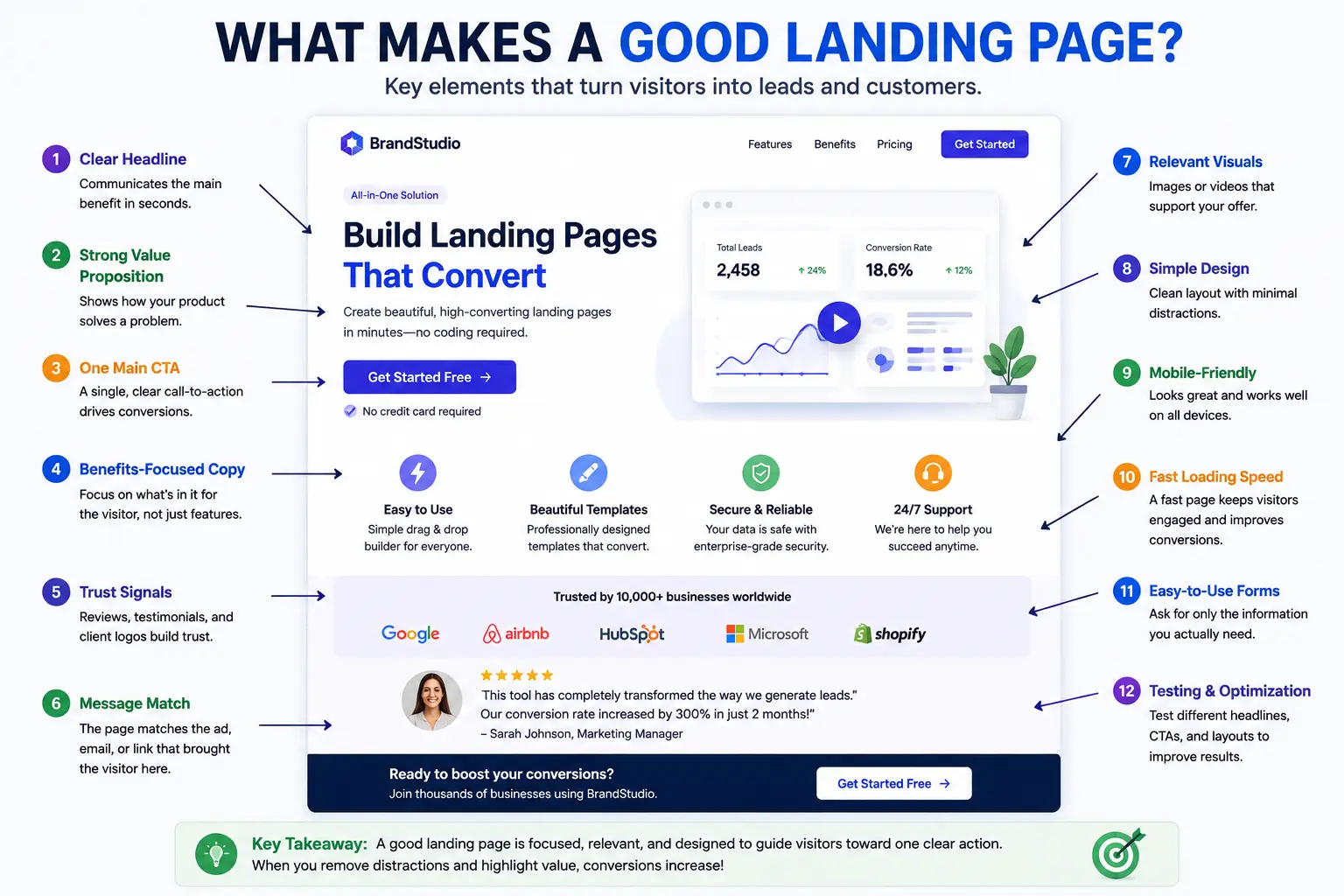
What makes a good landing page isn’t a specific color scheme or a trendy layout — it’s a structure that removes every unnecessary decision so a visitor can do exactly one thing, quickly and confidently.
This guide breaks down the actual anatomy of a strong landing page section by section, the design principles behind why each part works, and the structural decisions that separate a page that converts from one that just looks nice. Rather than generic tips, you’ll walk away knowing exactly what to build and why.
Table of Contents
The Core Principle Behind Every Good Landing Page
Before looking at individual sections, it helps to understand the single idea that everything else builds on: a landing page should remove every choice except the one you want the visitor to make.
A regular website page offers multiple paths — browse this, read that, click here instead. A landing page deliberately narrows that down to one path. Every section, image, and line of text should either build the case for that one action or get out of the way.
Analogy: Think of a landing page like a hallway with a single door at the end, rather than a room full of doors. The visitor isn’t wondering where to go — there’s only one direction, and the page’s job is simply to make walking toward it feel like the obvious choice.
The Anatomy of a Landing Page (Section by Section)
Here’s the structure that appears, in some form, on nearly every high-performing landing page — from the top of the page to the bottom.
1. Headline and subheadline
This is the first thing visitors read, and it needs to instantly confirm they’re in the right place. The headline states the core benefit or offer in as few words as possible; the subheadline adds just enough detail to support it.
Weak example: “Welcome to Our Platform” Strong example: “Manage Your Team’s Tasks Without the Chaos” — followed by a subheadline like “Free 14-day trial. No credit card required.”
The strong version tells the visitor exactly what they’ll get and removes an obvious hesitation (needing a credit card) immediately.
2. Hero image or video
A visual that reinforces the offer — a product screenshot, a short demo video, or an image showing the outcome the visitor wants. This isn’t decoration; it should make the offer feel real and tangible within a second or two of landing on the page.
3. Primary call to action (CTA)
The single button or form that represents the entire goal of the page. This typically appears near the top (often called “above the fold,” meaning visible without scrolling) and repeats again further down the page for visitors who need more convincing first.
Effective CTA button text is specific, not generic: “Start My Free Trial” outperforms a vague “Submit” or “Click Here,” since specific language reduces uncertainty about what happens next.
4. Supporting benefits or features
A short section (often three to five points) explaining what the visitor actually gets. The key distinction here is benefits vs. features — a feature describes what something does; a benefit describes what that means for the visitor.
Feature: “Automated weekly reports.” Benefit: “Know exactly how your team is performing, without spending an hour building reports yourself.”
Good landing pages lead with the benefit and use the feature to support it, not the other way around.
5. Social proof
Testimonials, reviews, client logos, user counts, or case study snippets that reduce hesitation by showing other real people or businesses have already taken this same action successfully. Placing a testimonial near the CTA — rather than only at the bottom of the page — reinforces confidence right at the decision point.
6. Objection handling / FAQ section
Anticipates and directly answers the hesitations a visitor is likely having before converting — pricing concerns, how something works, or what happens after sign-up. This section exists specifically to remove doubt, not to provide general information.
7. Final call to action
A closing section that repeats the offer and CTA one more time, for visitors who scrolled through the entire page without converting earlier. This is often paired with a slight reinforcement of urgency or value (“Limited spots available” or “Join 10,000+ teams already using this”).
Landing Page Structure: Visual Hierarchy Table
| Section | Purpose | Typical Position |
| Headline + subheadline | Confirm relevance, state the offer | Top |
| Hero image/video | Make the offer tangible | Top, alongside headline |
| Primary CTA | The single conversion action | Above the fold, repeated below |
| Benefits/features | Explain what the visitor gets | Middle |
| Social proof | Build trust and reduce hesitation | Middle, near CTA repeats |
| Objection handling/FAQ | Remove remaining doubts | Lower-middle |
| Final CTA | Last chance to convert | Bottom |
Not every landing page needs every section in this exact order — a simple email opt-in page might skip the FAQ section entirely, while a higher-consideration sales page might need multiple rounds of social proof and objection handling. The structure should match how much convincing the specific offer actually requires.
Design Principles That Make a Landing Page Work
Structure explains what goes on the page; these principles explain how it should look and feel.
Visual hierarchy
Guide the eye deliberately using size, contrast, and spacing — the most important elements (headline, CTA) should be immediately obvious, while supporting details are visually secondary. If everything on the page is the same size and weight, nothing stands out.
One primary color for the CTA
Using a distinct, consistent color exclusively for your call-to-action button (not used elsewhere on the page) makes it instantly recognizable as the action to take, even to a visitor skimming quickly.
Generous white space
Empty space around key elements isn’t wasted — it draws attention to what surrounds it. A cluttered page with no breathing room makes every element compete for attention, which weakens the impact of all of them.
Consistency
Repeated spacing, consistent fonts (ideally just one or two across the whole page), and a limited color palette make a page feel intentional and trustworthy, rather than assembled from mismatched pieces.
Mobile-first layout
Since a large share of landing page traffic arrives through ads and social platforms viewed on phones, the layout needs to work cleanly on a small screen first, then scale up — not the reverse.
How to Design a Landing Page: A Practical Process
- Define the single goal first. Before designing anything, know exactly what action the page exists to drive.
- Write the headline before building the layout. If you can’t state the offer clearly in one sentence, the design won’t fix that problem.
- Sketch the section order using the anatomy above as a starting template, adjusting based on how much convincing your specific offer needs.
- Design for the CTA first, then build around it. Many designers make the mistake of designing the page and adding a button at the end — instead, treat the CTA as the anchor everything else supports.
- Test on mobile before finalizing. Catch layout issues on a small screen before treating the design as complete.
- Launch, then measure and adjust. A landing page’s first version is a starting point, not a finished product — real visitor behavior will reveal what to refine.
Real-World Example Breakdown
A fitness app landing page promoting a free trial might structure this way:
- Headline: “Build a Workout Routine You’ll Actually Stick To”
- Hero image: A short video showing the app’s workout tracking in action
- Primary CTA: “Start Free 7-Day Trial” button, visible without scrolling
- Benefits: Personalized plans, progress tracking, no equipment required
- Social proof: “Join 200,000+ people who’ve completed a workout this week” plus a few short user testimonials
- FAQ: “Do I need a gym membership?” / “Can I cancel anytime?”
- Final CTA: Repeated “Start Free 7-Day Trial” button at the bottom, paired with a no-risk reassurance like “Cancel anytime, no charge during your trial”
Every section here supports the same single goal — getting a visitor to start that free trial — without introducing any competing paths or distractions.
Common Mistakes That Weaken a Landing Page
- Burying the CTA below too much content. If a visitor has to scroll extensively before finding out what to actually do, the page has already lost momentum.
- Listing features without translating them into benefits. A list of technical specs means little if the visitor doesn’t understand what it does for them specifically.
- Overloading the page with multiple competing offers. A page trying to sell a product, collect an email, and promote a webinar simultaneously dilutes focus and typically underperforms compared to one clear goal.
- Using generic, low-information CTA text. “Submit” or “Click Here” gives no indication of what happens next, unlike specific language like “Get My Free Guide.”
- Skipping the mobile experience. Designing exclusively for desktop, then treating mobile as an afterthought, often breaks the visual hierarchy that made the desktop version effective.
- Adding full site navigation. Every link away from the page is a chance to lose the visitor before they complete the one action the page exists to drive.
Best Practices for Building a Great Landing Page
- Match the headline to the traffic source. A visitor from a specific ad should see language that directly reflects what that ad promised, not generic brand messaging.
- Keep forms as short as possible, asking only for information genuinely needed at this stage of the relationship.
- Place social proof near the CTA, not just at the bottom of the page, so reassurance arrives right at the moment of decision.
- Repeat the CTA at natural break points, rather than relying on visitors to scroll all the way back to the top.
- Test one major element at a time (headline, CTA text, hero image) to clearly identify what’s actually driving performance changes.
- Review real visitor behavior, not just design instincts, using tools like heatmaps or session recordings to see where visitors hesitate or drop off.
Frequently Asked Questions
What makes a good landing page structurally?
A clear headline stating the offer, a supporting hero image, a prominent primary call to action, benefit-focused content, social proof, and a repeated final CTA — all working toward one single conversion goal without distracting navigation or competing offers.
How long should a landing page be?
It depends on the offer’s complexity. Simple, low-commitment actions (like an email sign-up) usually work well as shorter pages, while bigger-ticket purchases or complex services often need longer pages that address more objections before asking for the conversion.
Should a landing page have navigation links?
Generally no, or very minimal navigation at most. Every link away from the page is a potential distraction that can pull a visitor away before completing the intended action.
What’s the difference between a feature and a benefit on a landing page?
A feature describes what something does (e.g., “automated reports”), while a benefit describes what that means for the visitor (e.g., “save an hour a week”). Strong landing pages lead with benefits and use features to support them.
How many calls to action should a landing page have?
Ideally just one specific action, though the same CTA can repeat multiple times down the page. Multiple different offers competing for attention typically reduce overall conversion rates.
Do I need social proof on every landing page?
It’s strongly recommended, especially for higher-commitment actions like purchases or sign-ups involving payment information. Lower-commitment pages, like a simple email opt-in, can sometimes perform well with minimal or no social proof if the offer itself is compelling enough.
Final Thoughts
What makes a good landing page ultimately comes down to focus: a clear headline, one primary action, and a structure that anticipates and removes hesitation at every step — rather than any specific design trend or template.
Start with the anatomy covered here as a foundation, adapt the amount of content based on how much convincing your specific offer requires, and treat the first version as a starting point to refine using real visitor behavior, not a final, untouchable design.