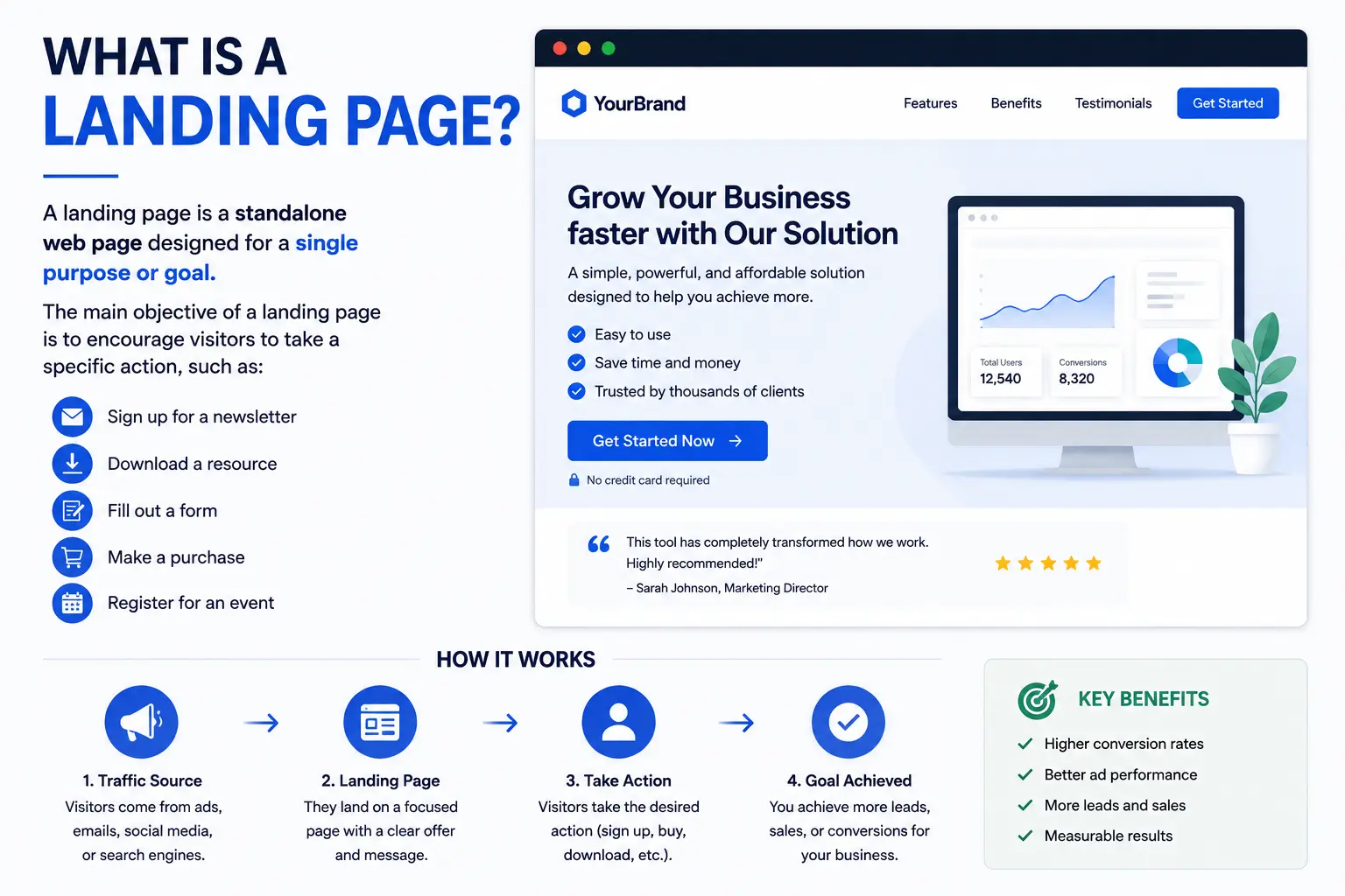
What is a landing page? In simple terms, it’s a standalone web page built for one specific purpose: getting a visitor who arrives from a single source — an ad, an email, a social post — to take one clear action, whether that’s buying, signing up, or requesting more information.
Unlike a homepage or a general website page, a landing page doesn’t try to do everything. It exists to do exactly one job extremely well. This guide covers the full definition, the main types you’ll encounter, real examples of what strong ones look like, and the specific elements that separate a landing page that converts from one that quietly fails.
Table of Contents
Landing Page Definition
A landing page is a dedicated web page designed around a single conversion goal, typically reached through a specific marketing campaign — a paid ad, an email link, a social media post, or a QR code — rather than through a website’s main navigation.
The defining trait isn’t where it lives on a website; it’s what it’s built to do. A landing page strips away distractions (like a full navigation menu) and focuses entirely on convincing one type of visitor to complete one specific action.
Analogy: If a website is like a department store, a landing page is a single, focused kiosk set up for one specific promotion — nothing else competing for the visitor’s attention, just one clear offer and one place to act on it.
What Is a Landing Page in SEO?
In the context of search engine optimization, “landing page” takes on a slightly broader meaning: it refers to whichever page a visitor first arrives on from a search engine results page, regardless of whether that page was specifically built for marketing purposes.
So while a marketing landing page is intentionally built for one conversion goal, an “SEO landing page” can technically be any page — a blog post, a product page, or even a homepage — that ranks in search results and receives that initial visit. Both meanings matter depending on context: marketers use “landing page” to describe a purpose-built conversion page, while SEO analytics tools use it more broadly to describe entry points into a site.
Key Elements of an Effective Landing Page
Regardless of type, strong landing pages share several core components. Understanding these matters more than any specific design trend, since they explain why a landing page converts, not just what it looks like.
- A focused headline that matches exactly what the visitor expected based on the ad, email, or link they clicked.
- A single, clear call to action (CTA) — a button or form, repeated at key points, with no competing offers.
- Minimal or no navigation menu, since every additional link is a chance to lose the visitor before they convert.
- Supporting content (benefits, features, testimonials) that reinforces the one specific offer, not general brand information.
- Trust signals — reviews, security badges, guarantees, or client logos — that reduce hesitation right before the point of action.
- Fast loading speed, since landing pages are often the first (and sometimes only) interaction a visitor has with the brand.
Types of Landing Pages
Not all landing pages work the same way. The right type depends entirely on the specific goal behind the page.
| Type | Primary Goal | Typical Structure |
| Lead generation page | Collect visitor information (email, phone) | Short form, single clear benefit statement |
| Click-through page | Warm up a visitor before sending them to purchase | Product explanation, ends with a “Continue” or “Buy Now” button |
| Sales/product landing page | Drive a direct purchase | Product details, pricing, reviews, strong CTA |
| Webinar/event registration page | Get sign-ups for a specific event | Date, speaker info, single registration form |
| Squeeze page | Capture an email address, often exchanging a free resource | Very minimal content, single form, strong incentive |
| Thank-you/confirmation page | Confirm a completed action, sometimes upsell | Confirmation message, optional next-step offer |
Lead generation landing pages
These focus on collecting contact information — usually an email address — in exchange for something valuable, like a free guide, consultation, or discount code. The form is the centerpiece; everything else on the page exists to convince the visitor the exchange is worth it.
Product landing pages
A product landing page is built around a single product or service, often used for a specific launch, promotion, or ad campaign. It typically includes detailed product benefits, pricing, images or demos, and a direct purchase or sign-up button — everything a visitor needs to decide, without navigating elsewhere on the site.
Sales landing pages
A sales landing page takes the product landing page concept further, often built for a limited-time offer or a bigger-ticket purchase. These tend to be longer, addressing objections directly, building urgency (like a countdown or limited stock message), and layering in stronger trust signals like testimonials, guarantees, or case studies.
Landing Page Examples in Action
Seeing this in context makes the concept click faster than definitions alone.
Example 1 — Software free trial: A project management tool runs a search ad for “best team task app.” Clicking it leads to a page showing exactly that: a short explanation of team task management, a screenshot of the interface, and a single “Start Free Trial” button — no pricing page, no blog links, no distractions.
Example 2 — E-commerce product launch: A skincare brand promotes a new serum through Instagram ads. The linked landing page shows the product, key ingredients, before/after photos, customer reviews, and one “Add to Cart” button — with no link back to the brand’s full product catalog.
Example 3 — Webinar sign-up: A marketing agency sends an email inviting subscribers to a free webinar. The link leads to a page with the webinar topic, date, speaker bio, and a single registration form — that’s the entire page.
Example 4 — Lead magnet squeeze page: A financial coach offers a free budgeting template in exchange for an email address. The page has almost no content beyond a headline, a short benefit list, and an email capture form — deliberately minimal to keep focus entirely on the exchange.
What Makes the “Perfect” Landing Page
There’s no single universal template, since the right approach depends on the offer and audience — but the strongest landing pages consistently share these traits:
- Message match: The headline and content mirror exactly what the visitor clicked to get there. A mismatch between the ad and the landing page is one of the fastest ways to lose a visitor’s trust.
- One goal, one action: Every element on the page supports a single conversion point, without competing offers pulling attention elsewhere.
- Clear value, stated early: Visitors decide whether to stay within seconds — the core benefit should be obvious without scrolling.
- Reduced friction: Short forms, simple navigation (or none at all), and a straightforward path to completing the action.
- Mobile-first design: Since much landing page traffic comes from social media and mobile ads, the layout needs to work cleanly on a small screen first.
- Proof, not just promises: Testimonials, reviews, or data points that back up the claims being made.
Landing Page vs. Homepage vs. Regular Web Page
Since these terms often get used loosely, a quick comparison helps clarify exactly where a landing page fits.
| Landing Page | Homepage | Regular Web Page | |
| Purpose | One specific conversion goal | General introduction to the whole site | Informational or supporting content |
| Navigation | Minimal or none | Full site navigation | Full site navigation |
| Audience | Visitors from one specific campaign | Anyone finding the site | Mixed, depending on content |
| Linked from main menu? | Usually not | Yes (it’s the main hub) | Often yes |
Common Mistakes When Building a Landing Page
- Sending traffic to a homepage instead. A homepage forces visitors to search for the specific offer, reducing the chance they convert compared to a dedicated, matching landing page.
- Including full site navigation. Every navigation link is a potential exit before the visitor completes the intended action.
- Weak message match. If an ad promises “50% off” and the landing page doesn’t mention that discount immediately, visitors often bounce, assuming they clicked the wrong link.
- Asking for too much information upfront. Long forms with unnecessary fields reduce completion rates — ask only for what’s genuinely needed at this stage.
- Multiple competing calls to action. A page offering a free trial, a demo request, and a newsletter sign-up all at once dilutes focus and typically converts worse than one clear option.
- Ignoring mobile design. Since much landing page traffic originates from ads and social platforms, a page that isn’t mobile-optimized loses a large share of potential conversions immediately.
Best Practices for Landing Pages
- Build a new landing page for each distinct campaign, rather than reusing one generic page across multiple offers.
- Keep forms as short as possible, only requesting information that’s essential for that specific stage of the relationship.
- Test one major change at a time (headline, CTA wording, image) so you can clearly identify what actually improves conversion.
- Match your landing page’s tone and imagery to the specific ad or email that led the visitor there, for a seamless, trustworthy experience.
- Include social proof close to the call to action, since reassurance right before the decision point meaningfully reduces hesitation.
- Measure conversion rate specifically, not just traffic — a landing page’s success is judged by how many visitors complete the intended action, not simply how many arrive.
Frequently Asked Questions
What is a landing page in simple terms?
A landing page is a standalone web page built around one specific goal — like signing up, buying, or registering — usually reached through a targeted ad, email, or campaign link rather than a website’s main navigation.
What is the difference between a landing page and a website?
A website is the full collection of pages representing a business or brand, including a homepage, product pages, and content. A landing page is one focused, standalone page within (or sometimes outside) that structure, built for a single conversion goal.
What is a good example of a landing page?
A common example is a page linked from a paid ad promoting a specific product or free trial, showing only information relevant to that offer — a headline matching the ad, key benefits, and one clear call-to-action button, with no distracting navigation.
Do I need a website to have a landing page?
Not necessarily. Landing pages can exist as standalone pages, hosted independently of a full website, especially for a single campaign, product launch, or lead generation effort.
What’s the difference between a landing page and a squeeze page?
A squeeze page is a specific, more minimal type of landing page focused almost entirely on capturing an email address, typically in exchange for a free resource. A general landing page can have a broader range of goals, from sales to registrations to lead generation.
How long should a landing page be?
It depends on the offer. Simple, low-commitment actions (like a free newsletter sign-up) usually work best with short pages. Bigger-ticket purchases or complex offers often need longer pages that address objections and build trust before asking for the conversion.
Final Thoughts
A landing page is, at its core, a page with one job: convert a specific type of visitor into a lead, sign-up, or sale, without the distractions a regular website page carries. The type you build — lead generation, product, sales, or event registration — depends entirely on the specific goal behind your campaign.
Whatever the format, the strongest landing pages share the same foundation: a message that matches exactly what brought the visitor there, one clear action, and just enough supporting content to make that action feel like an easy decision.