Most visitors to your site are opening it on a phone, not a laptop, which makes learning how to make a website mobile friendly one of the most important things you can do for both your visitors and your search rankings. A site that looks great on a desktop but forces phone users to pinch, zoom, and scroll sideways will lose visitors fast — and Google notices that too.
This guide covers exactly what “mobile-friendly” means, the specific technical elements that make it happen, how to check your own site, and the mistakes that trip up even experienced site owners.
Table of Contents
What Does “Mobile-Friendly” Actually Mean?
A mobile-friendly website is one that automatically adjusts its layout, text size, images, and navigation to fit whatever screen it’s being viewed on — a phone, a tablet, or a desktop — without the visitor needing to zoom in or scroll sideways to read anything.
The technical term for the most common approach is responsive web design: instead of building a separate “mobile version” of your site, the same page reflows itself based on the screen size viewing it. Think of it like water taking the shape of whatever container it’s poured into — the content stays the same, but the layout adapts to fit.
Why Mobile-Friendliness Matters
Two things make this non-negotiable in 2026, not just a nice-to-have:
- Most web traffic comes from phones. Well over half of global web traffic now happens on mobile devices, meaning a poor mobile experience affects the majority of your visitors, not a minority.
- Google indexes and ranks based on the mobile version of your site, a practice called mobile-first indexing. If your mobile experience is broken or incomplete, it can directly hurt how you rank in search — even for people searching from a desktop.
In short: mobile-friendliness isn’t a separate feature anymore. For most sites, it’s the primary version of your website that matters most.
The Core Elements of a Mobile-Friendly Website
Here’s what actually needs to be in place, explained in plain terms.
1. The Viewport Meta Tag
This is a small piece of code in your site’s HTML that tells the browser how to scale the page on different screen sizes. Without it, phones often render your desktop layout shrunk down to fit, forcing visitors to zoom in to read anything.
What it looks like in the code:
<meta name=”viewport” content=”width=device-width, initial-scale=1.0″>
If you’re using a website builder (Wix, Squarespace, WordPress, etc.), this is almost always added automatically. If you’re coding a site by hand, this is one of the first things to add.
2. Responsive Layouts (Flexible Grids)
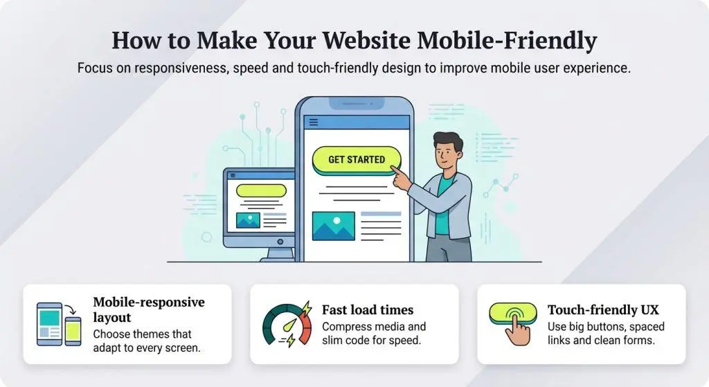
Instead of fixed pixel widths, mobile-friendly sites use flexible units (like percentages) so columns and containers resize based on the available screen width, rather than staying a fixed size that overflows a small screen.
3. Media Queries (Breakpoints)
A media query is a rule in your site’s CSS (the code that controls styling) that says “apply these style changes only when the screen is below a certain width.” The screen widths where the layout changes are called breakpoints.
Example: A three-column layout on desktop might collapse into a single column below 768 pixels wide, so content stacks vertically instead of squeezing into narrow columns.
4. Readable Font Sizes Without Zooming
Text should be legible at a normal viewing distance without the visitor needing to zoom in. A common guideline is a minimum of 16 pixels for body text on mobile.
5. Tap Targets Sized for Fingers, Not Cursors
Buttons and links need enough space around them to tap accurately with a finger, which is far less precise than a mouse cursor. Cramped navigation menus and tiny buttons are one of the most common mobile usability complaints.
6. Images That Scale and Load Efficiently
Images should resize to fit their container rather than overflowing the screen, and ideally load a smaller file size on mobile devices to keep pages fast on slower connections.
7. No Horizontal Scrolling
If a visitor has to scroll sideways to see content that got cut off, something on the page is wider than the screen — usually an image, table, or fixed-width element that wasn’t set up to resize.
8. Avoiding Incompatible Technology
Older sites sometimes rely on plugins like Flash, which modern mobile browsers don’t support at all. If any part of your site depends on Flash or similar outdated technology, it needs to be rebuilt using standard HTML, CSS, and JavaScript.
How to Make a Website Mobile Friendly: Step-by-Step
If You’re Using a Website Builder or CMS (WordPress, Wix, Squarespace, etc.)
- Choose a responsive theme or template. Nearly all modern templates are responsive by default, but always confirm before committing to one, especially with older or heavily customized themes.
- Preview the mobile view before publishing. Most builders have a built-in device preview toggle (desktop/tablet/mobile) — use it on every page, not just the homepage.
- Check your navigation menu on mobile. Confirm it collapses into a clean mobile menu (commonly a “hamburger” icon) rather than displaying a full desktop menu squeezed onto a small screen.
- Resize or crop images for mobile if the builder allows it. Some platforms let you set different image crops for mobile versus desktop.
- Test every form and button on an actual phone, not just the builder’s preview, since real devices sometimes render slightly differently.
If You’re Coding Your Site Yourself
- Add the viewport meta tag to the <head> of every page.
- Use relative units (percentages, em, rem) instead of fixed pixel widths for layout containers.
- Write media queries for at least two breakpoints — a common starting point is one for tablets (around 768px) and one for phones (around 480px).
- Use a mobile-first CSS approach when possible: write your base styles for small screens first, then add rules for larger screens as the layout allows more room. This tends to produce cleaner, simpler code than starting from desktop and shrinking down.
- Set images to scale with their container using CSS like max-width: 100%; height: auto; so they never overflow.
- Test tap target spacing — buttons and links should have enough padding to tap comfortably with a finger.
How to Test If Your Website Is Mobile Friendly
Google retired its standalone Mobile-Friendly Test tool in 2023, so if you’ve seen that tool mentioned elsewhere, it no longer works. Here’s what to use instead:
- Google PageSpeed Insights. Enter your URL and check the mobile tab — it runs a full audit covering mobile usability alongside speed, including viewport configuration and tap target sizing.
- Google Search Console. Check for any flagged usability issues under your site’s core web vitals and indexing reports.
- Your browser’s built-in device toolbar. Most browsers let you simulate different phone screen sizes directly from developer tools, which is useful for a quick visual check without needing a physical device.
- An actual phone. Nothing replaces opening your real site on a real device — emulators are close, but not identical to real-world rendering and touch behavior.
Responsive vs. Adaptive vs. Separate Mobile Site
| Approach | How It Works | Pros | Cons |
| Responsive design | One page, layout adjusts fluidly to any screen size | Easiest to maintain, one URL, Google’s preferred approach | Can require more careful CSS planning upfront |
| Adaptive design | Multiple fixed layouts, one served based on detected screen size | Precise control over each device size | More work to build and maintain multiple versions |
| Separate mobile site (m.site.com) | An entirely separate site built for mobile devices | Was common years ago | Outdated approach — duplicate content to maintain, generally discouraged today |
For nearly every website built today, responsive design is the right choice. Adaptive design still shows up in some complex enterprise sites, but a separate mobile subdomain is largely a legacy approach at this point.
Common Mistakes That Break Mobile-Friendliness
- Forgetting the viewport meta tag. Without it, mobile browsers often just shrink the whole desktop layout, making text unreadably small.
- Using fixed-width elements. A table, image, or container set to an exact pixel width that’s wider than the phone screen forces horizontal scrolling.
- Tiny tap targets crammed together. Small buttons placed close together cause visitors to tap the wrong thing, especially in navigation menus.
- Uncompressed, oversized images. Large image files slow down mobile load times significantly, especially on cellular connections.
- Pop-ups that cover the whole screen. Intrusive interstitials are both a poor user experience and something Google specifically penalizes on mobile.
- Testing only on your own phone. Different screen sizes and operating systems can render things differently — check a range of devices or use a device emulator with multiple screen sizes.
- Assuming your builder’s default template is automatically fine. Always preview and test rather than assuming.
Best Practices for Mobile-Friendly Website Design
- Design mobile-first when building from scratch. It’s easier to expand a simple mobile layout for larger screens than to simplify a complex desktop layout down.
- Keep navigation simple. A collapsed menu with clear, short labels works better on mobile than a long list of nested menu items.
- Prioritize your most important content near the top. Mobile visitors scroll through less content overall than desktop visitors, so don’t bury key information (like a call-to-action or contact info) too far down the page.
- Compress images before uploading. Smaller file sizes load faster, especially over mobile data connections.
- Test forms specifically. Form fields, dropdowns, and date pickers are common trouble spots for mobile usability — verify each one is easy to fill out with a thumb.
- Recheck mobile-friendliness after every major redesign. A single new element (like an embedded video or wide table) can quietly break your mobile layout if it’s added without testing.
Frequently Asked Questions
How do I know if my website is mobile friendly? Use Google PageSpeed Insights (mobile tab) to check for usability issues, review any flags in Google Search Console, and manually test your site on an actual phone to confirm navigation, text size, and forms all work smoothly.
Do website builders like Wix and Squarespace make websites mobile friendly automatically? Most modern templates from major builders are responsive by default, but you should still preview and test the mobile version of every page yourself, since custom elements (embedded widgets, unusual layouts) can sometimes break on smaller screens.
What’s the difference between a mobile-friendly and a responsive website? “Mobile-friendly” describes the end result — a site that works well on phones. “Responsive design” is the specific technique most commonly used to achieve that result, where one page adjusts its layout automatically based on screen size.
Does mobile-friendliness actually affect SEO rankings? Yes. Google uses mobile-first indexing, meaning it primarily evaluates the mobile version of your site for ranking purposes, so a poor mobile experience can affect your search visibility even for desktop searches.
Is there a free tool to test mobile-friendliness now that Google’s Mobile-Friendly Test is gone? Yes — Google PageSpeed Insights remains free and includes mobile usability checks as part of its broader audit, and Google Search Console will flag major mobile usability issues if they’re detected on your site.
How much does it cost to make an existing website mobile friendly? If you’re using a modern website builder with a responsive template, it typically costs nothing beyond your existing plan. If you have an older custom-coded site built before responsive design was standard, you may need a developer to rebuild the layout, which can range from a simple CSS update to a more substantial redesign depending on how outdated the code is.
Final Thoughts
Making a website mobile friendly comes down to a handful of concrete technical elements — the viewport tag, flexible layouts, readable text, properly sized tap targets, and images that scale correctly — combined with actually testing the result on a real phone, not just assuming your template handles it. Since the majority of visitors and Google’s own indexing now treat mobile as the default experience, this isn’t an optional polish step anymore; it’s the foundation your website is judged on first.