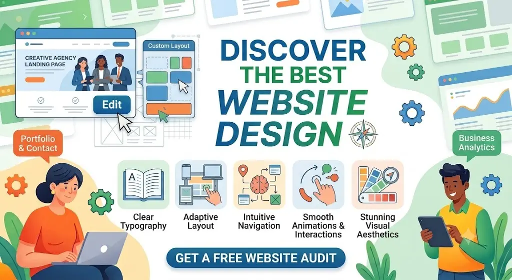
When people search for best website design, they’re usually after one of two things: inspiration for their own project, or a clear understanding of what separates a great website from an average one. This guide covers both.
Instead of just listing pretty screenshots, this article breaks down why certain designs work — the principles, layout choices, and psychology behind them — so you can apply the same thinking to your own site, whether you’re a designer, a founder, or someone hiring one.
Table of Contents
What Makes a Website Design “the Best”?
A beautiful website and a good website design aren’t always the same thing. Awwwards and Dribbble showcase stunning visuals, but visual flair alone doesn’t make a design effective for a real business.
The best website design does three things at once:
- Looks intentional — every color, font, and spacing choice feels deliberate, not accidental.
- Communicates instantly — a visitor understands what the site is for within seconds.
- Performs well — it loads fast, works on every device, and guides visitors toward an action.
A site can win design awards and still fail at converting visitors. The strongest examples balance creativity with usability — that combination is what this guide focuses on.
Core Principles Behind Every Great Website Design
1. Visual Hierarchy
Visual hierarchy is the order in which your eyes naturally move across a page. Designers control this through size, color, contrast, and spacing — bigger and bolder elements get noticed first.
Example: On a strong home page, the headline is the largest text on screen, the supporting subtext is smaller, and the call-to-action button uses a contrasting color so it stands out from everything around it.
2. Whitespace (Negative Space)
Whitespace is the empty space between elements — and it’s one of the most underused tools in design. Cramming a page with text and images makes it feel cluttered and hard to read. Generous spacing makes even simple content feel premium.
Think of whitespace like pauses in speech: without them, everything blurs together; with them, each idea gets room to land.
3. Typography
Typography is the art of choosing and arranging text. Great designs typically use:
- One font for headlines, one for body text (rarely more than two font families total)
- A clear size difference between headings and paragraphs
- Enough line spacing that paragraphs don’t feel dense
Poor typography is one of the fastest ways to make a professional business look amateur — it’s often more damaging than a weak color palette.
4. Color and Contrast
Color creates mood and guides attention, but contrast is what makes a design usable. Text should always have strong contrast against its background, and one accent color should be reserved specifically for calls to action so buttons are impossible to miss.
5. Motion and Micro-interactions
Small animations — a button that shifts slightly on hover, a section that fades in as you scroll — make a site feel alive and modern without being distracting. This is a hallmark of many award-winning, creative website designs, but it should always support the content, not compete with it.
6. Consistency
Every award-winning design shares one trait: consistency. Buttons look and behave the same way across the whole site. Spacing follows a repeatable pattern. This consistency is what makes a design feel professionally built rather than assembled page by page.
Best Website Design Examples by Category
Rather than naming specific brands (which change designs frequently), here’s how top-performing sites approach design across different goals — a more durable reference than a snapshot list.
| Category | Design Priority | Common Technique |
| Creative agency / portfolio | Bold, unique visuals | Full-screen imagery, unconventional layouts, custom cursors |
| SaaS / product | Clarity and conversion | Product screenshots, short demo videos, clear pricing |
| E-commerce | Speed and trust | High-quality product photography, visible reviews, simple checkout |
| Corporate / enterprise | Credibility and structure | Clean grid layout, clear navigation, professional photography |
| Personal portfolio | Individuality | Custom typography, storytelling layout, minimal navigation |
Creative and experimental designs (the kind you’ll find on Awwwards) tend to prioritize originality — unusual scroll effects, 3D elements, and bold typography. These work well for agencies and personal brands where standing out is the goal.
Conversion-focused designs (common in SaaS and e-commerce) prioritize clarity over novelty. Every unconventional design choice is tested against one question: does it help or hurt the visitor’s ability to take action?
Understanding which category your project falls into is the single biggest factor in deciding how experimental your design should be.
Modern Website Design Trends
Design trends shift, but a few themes have stayed consistently relevant in recent years:
- Minimalism with purpose — fewer elements, but each one working harder.
- Large, expressive typography — oversized headlines used as a design element, not just text.
- Dark mode options — especially common on developer tools and creative portfolios.
- Scroll-triggered animation — content that reveals itself as the user scrolls, creating a sense of pace.
- Custom illustration over generic stock photography — brands increasingly use original artwork or 3D graphics to stand out.
- Accessibility-first design — high contrast, readable font sizes, and keyboard navigation are now considered part of good design, not an afterthought.
A modern website doesn’t need every trend at once. The best designs pick two or three that fit the brand and execute them well, rather than combining every trend into one page.
Creative vs. Conversion-Focused Design: Which Do You Need?
This is one of the most common points of confusion, so here’s a direct comparison:
| Creative Website Design | Conversion-Focused Design | |
| Primary goal | Memorability, brand impression | Leads, sales, sign-ups |
| Best for | Agencies, artists, personal brands | SaaS, e-commerce, local businesses |
| Risk | Can confuse or slow down visitors | Can feel generic if overdone |
| Typical layout | Experimental, non-linear | Clear top-to-bottom flow |
| Success metric | Engagement, awards, shares | Conversion rate |
Neither approach is “better” — they solve different problems. A creative agency showcasing unique website designs to attract clients needs to demonstrate originality. A local business or SaaS company needs visitors to take a specific action quickly. Mixing up which one your business needs is one of the most common design mistakes.
How to Choose the Right Website Designer
If you’re hiring rather than designing yourself, look for:
- A portfolio in your category. A designer skilled in bold creative sites isn’t automatically the best fit for a conversion-focused SaaS site, and vice versa.
- Proof of performance, not just visuals. Ask if past projects improved load speed, conversions, or engagement — not just how they look.
- A collaborative process. Top website designers explain their reasoning, not just their aesthetic choices.
- Responsive design experience. Every design should be shown working on mobile, not just desktop mockups.
Common Mistakes in Website Design
- Prioritizing looks over usability. A stunning homepage that confuses visitors about what to do next will underperform a simpler, clearer one.
- Too many fonts and colors. This is the fastest way to make a design feel unpolished.
- Ignoring mobile design. A layout that only looks good on a large desktop screen fails the majority of real visitors.
- Overusing animation. Motion should guide attention, not distract from the message.
- Copying trends without a reason. A dark mode toggle or 3D hero animation only helps if it fits the brand and audience.
- Slow load times from oversized visuals. High-resolution images and heavy animations look great in a portfolio but can hurt real-world performance if not optimized.
Best Practices Checklist
- [ ] Visual hierarchy guides the eye to the most important content first
- [ ] No more than two font families used across the site
- [ ] One consistent accent color used for all calls to action
- [ ] Design tested and adjusted specifically for mobile screens
- [ ] Whitespace used generously, not treated as wasted space
- [ ] Animations support the content rather than distract from it
- [ ] Every page has a clear next step for the visitor
- [ ] Images are optimized so design quality doesn’t cost load speed
Frequently Asked Questions
What is considered the best website design? There’s no single “best” design — the best website design is the one that fits its purpose. A creative agency’s award-winning site and a SaaS company’s high-converting site look completely different, but both can be considered excellent design for their specific goal.
Where can I find inspiration for a modern website? Design showcase sites are useful for spotting trends and creative techniques, but it’s worth studying sites within your own industry too, since a design that wins awards for a creative studio may not suit a corporate or e-commerce brand.
What makes a website design look unique instead of generic? Custom typography, original illustration or photography instead of stock imagery, and a distinct color palette are the biggest differentiators. Generic designs usually rely on default template styling with little customization.
Do creative, award-winning designs convert well? Not always — and that’s fine, because they’re often optimized for a different goal, like brand impression or portfolio appeal rather than direct sales. If conversions are the priority, a simpler, clarity-first design usually performs better.
How much does a custom website design cost? Custom design work typically ranges from $1,000–$5,000 for a freelancer-built small business site to $10,000–$50,000+ for an agency-designed, highly custom, or animation-heavy site.
Is minimalism still considered the best approach to website design? Minimalism remains a strong default because it improves clarity and load speed, but “minimal” doesn’t mean plain — the best modern designs use minimalism deliberately, pairing simple layouts with strong typography and one or two standout design elements.
Final Thoughts
The best website design isn’t the one with the most animation or the flashiest layout — it’s the one that fits its purpose and executes the fundamentals well: hierarchy, typography, whitespace, and consistency. Creative, award-worthy design and high-converting design aren’t opposites; the strongest sites borrow from both, using originality to stand out and usability to keep visitors moving toward action.
Before starting your own project or hiring a designer, get clear on which goal matters most for your site. That single decision shapes almost every design choice that follows.