If you’ve ever left a website within seconds of landing on it, you already understand what makes a good website on some level — even if you couldn’t name exactly why you left. Visitors rarely articulate their frustration; they just click back and try a competitor instead.
This guide breaks down the specific, measurable qualities that separate great websites from forgettable ones. Rather than vague design advice, you’ll get concrete criteria you can check your own site against, along with real examples and common mistakes to avoid.
Table of Contents
Why This Question Matters More Than It Seems
A website isn’t judged the way a book or a poster is. Visitors decide whether to stay or leave within roughly the first few seconds, based on a mix of loading speed, visual clarity, and whether the page seems trustworthy. That means what makes a website good isn’t really a matter of taste — it’s a combination of measurable factors that directly affect whether people stay, trust you, and take action.
1. Clear Purpose and Message
Every strong website answers one question almost instantly: “What is this, and is it for me?”
A visitor should be able to tell within seconds:
- What the business, service, or content is about
- Who it’s for
- What they should do next (read more, buy, sign up, contact)
Weak example: A homepage with a vague slogan like “Innovating Tomorrow, Today” and no explanation of what the company actually does.
Strong example: A homepage headline like “Accounting software for freelancers — track expenses in under 2 minutes a day,” which instantly communicates the product and audience.
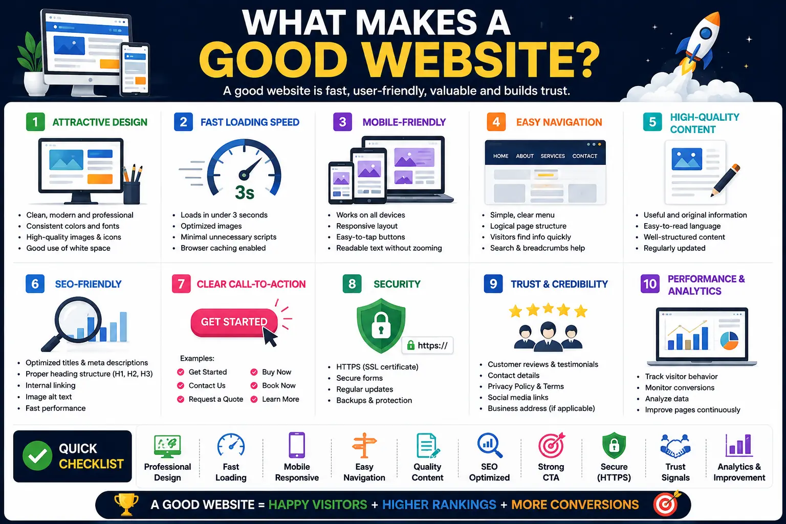
2. Fast Loading Speed
Page speed isn’t just a technical detail — it’s one of the most consistent factors separating good websites from frustrating ones. A page that takes several seconds to load loses a meaningful share of visitors before they even see the content.
Common causes of slow websites include:
- Oversized, uncompressed images
- Too many third-party scripts (ads, trackers, widgets) loading at once
- Poor quality web hosting
A good website loads its main content quickly, even on a mid-range phone with an average internet connection — not just on a fast office Wi-Fi network.
3. Mobile-Friendly (Responsive) Design
Responsive design means a website automatically adjusts its layout to fit any screen size — phone, tablet, or desktop — instead of forcing visitors to pinch and zoom.
Since a majority of web traffic today comes from mobile devices, a site that only works well on desktop is failing most of its visitors before they even read a word of content.
| Element | Poor Mobile Experience | Good Mobile Experience |
| Text size | Requires zooming to read | Readable at default zoom |
| Buttons | Too small to tap accurately | Large enough for a thumb tap |
| Navigation | Desktop menu crammed into a tiny space | Collapsible mobile-friendly menu |
| Images | Overflow the screen width | Scale automatically to fit |
4. Intuitive Navigation
Good navigation means a visitor can find what they’re looking for without thinking hard about it. This usually means:
- A clear, consistent menu across every page
- Logical categories (not overly clever or vague labels)
- A visible way to get back to the homepage
- A search bar for larger, content-heavy sites
If a visitor has to guess where to click, or scroll endlessly to find a contact page, the site’s navigation is working against them instead of for them.
5. Strong, Purposeful Design
Good design isn’t about looking trendy — it’s about supporting the site’s purpose without distracting from it. This includes:
- Consistent colors and fonts across every page
- Enough white space that the page doesn’t feel cluttered
- Visual hierarchy — headlines, subheadings, and body text that guide the eye naturally
- Images and graphics that add value, not just decoration
A well-designed site feels calm and easy to scan, even when it contains a lot of information.
6. High-Quality, Useful Content
Design gets visitors to stay for a few seconds. Content is what convinces them to stay longer, trust the site, and come back later.
Good website content is:
- Written in plain, clear language for its intended audience
- Organized with headings and short paragraphs, not dense walls of text
- Genuinely useful — answering real questions the visitor came with
- Kept up to date, rather than left stale for years
7. Accessibility for All Users
Accessibility means a website can be used by people with disabilities — including visual, hearing, motor, or cognitive impairments — not just the “average” visitor.
Basic accessibility practices include:
- Descriptive alt text on images (short descriptions read aloud by screen readers)
- Enough color contrast between text and background so text is easy to read
- The ability to navigate the entire site using only a keyboard
- Clear, descriptive link text (avoiding vague phrases like “click here”)
Accessibility isn’t a niche concern — it directly affects how many people can actually use your site, and it’s a factor search engines increasingly reward.
8. Trust Signals and Credibility
A good website answers the unspoken question every visitor has: “Can I trust this?” Trust signals include:
- Clear contact information (not hidden three menus deep)
- Genuine customer reviews or testimonials
- An About page with real information about the people or company behind the site
- A visible privacy policy, especially if the site collects any personal information
Sites that hide who’s behind them, or bury contact details, quietly lose visitor trust even if nothing else is wrong.
9. Security (HTTPS and Beyond)
A secure website uses HTTPS, shown as a small padlock icon in the browser’s address bar. This encrypts the data traveling between the visitor’s browser and the website’s server, protecting things like passwords or payment details from being intercepted.
A site without HTTPS — especially one that asks for any personal information — signals outdated maintenance and drives cautious visitors away immediately, often before they even read the content.
10. A Clear Call to Action
Every good website guides visitors toward a next step, called a call to action (CTA) — a button or link like “Get Started,” “Contact Us,” or “Add to Cart.”
Without a clear CTA, even an otherwise excellent website can fail to convert interested visitors into customers, subscribers, or leads, simply because it never asked them to do anything.
What Makes a Website Successful vs. What Makes It Merely “Good”
It’s worth separating two related but different ideas:
- A good website is well-built, fast, accessible, and easy to use.
- A successful website achieves its actual business goal — sales, sign-ups, engagement — on top of being good.
A beautifully designed website that never converts visitors into customers isn’t truly successful, even if every design principle was followed correctly. That’s why testing real user behavior (through analytics and feedback) matters as much as following design best practices.
Common Mistakes That Undermine a Good Website
- Prioritizing looks over usability. A visually striking site that’s confusing to navigate frustrates visitors more than a plain, well-organized one.
- Ignoring mobile testing. Many site owners only check their site on a desktop, missing serious mobile usability problems.
- Overloading pages with pop-ups and ads. Aggressive pop-ups that block content push visitors away almost instantly.
- Outdated content. A site that clearly hasn’t been updated in years signals neglect, even if the design still looks fine.
- No clear next step. Leaving visitors without an obvious action to take wastes the traffic a site worked hard to earn.
- Slow, bloated pages. Oversized images and unnecessary scripts quietly drive away visitors before they see anything else.
A Quick Website Quality Checklist
Use this as a fast self-audit for your own site:
- [ ] Loads in a few seconds or less on mobile
- [ ] Works cleanly on phone, tablet, and desktop
- [ ] Has a clear headline explaining what the site offers
- [ ] Uses consistent, uncluttered design
- [ ] Includes real, useful, up-to-date content
- [ ] Meets basic accessibility standards (alt text, contrast, keyboard navigation)
- [ ] Displays clear contact information and trust signals
- [ ] Uses HTTPS
- [ ] Has an obvious call to action on key pages
Frequently Asked Questions
What is the single most important factor in what makes a good website? There isn’t one single factor — clarity of purpose, loading speed, and mobile usability tend to matter most, since a site that fails any of these loses visitors before its content or design even gets evaluated.
What makes a website design good specifically? Good website design supports the site’s purpose rather than distracting from it — consistent colors and fonts, clear visual hierarchy, enough white space, and layouts that guide the visitor’s eye naturally toward important information and actions.
Can a website be good without being visually impressive? Yes. A plain but fast, clear, and easy-to-navigate website often performs better than a visually elaborate one that’s slow or confusing. Function tends to matter more than visual flair.
How important is content compared to design? Both matter, but content is usually what earns long-term trust and search visibility, while design determines whether visitors stay long enough to read that content in the first place.
Does a good website need to rank well on Google to be considered good? Not necessarily — a good website is well-built and usable regardless of its search ranking. That said, many of the same qualities that make a site good for visitors (speed, clear content, mobile-friendliness) also tend to help it rank better.
What’s a simple way to test if my website is actually good? Ask someone unfamiliar with your site to complete a specific task on it — like finding your contact page or a specific product — without help, and watch where they get confused or stuck.
Final Thoughts What Makes a Good Website?
What makes a good website ultimately comes down to removing friction: friction in finding information, friction in loading speed, friction in trusting the site, and friction in knowing what to do next. None of these ten qualities are exotic or expensive to fix — they’re foundational, and most weak websites are missing just two or three of them, not all ten.
Run through the checklist above against your own site today. Fixing even one weak area — slow images, a missing CTA, unclear navigation — often produces a noticeably better visitor experience almost immediately.